Color Theory
by Travis Jeppesen on May 10, 2008
Carsten Nicolai
Eigen + Art, Berlin
Through June 28th, 2008
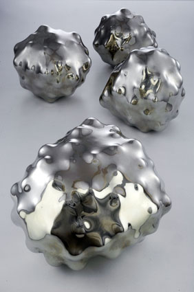
The day was a pinkish orange thing, and as I entered the gallery, the orange overwhelmed the pink in a way that was unbearable – especially the heat. It is generated by a large neon wall that reflects nothing – just the scent of its own burning. Surrounded by three panels of yellow – one on the left, two on the right – unilluminated. Four silver rocklike formations on a table in front. They reflect the light and energy of the neon, perhaps even radiate with a heat of their own. You suddenly realize that the heat is coming from above, not just in front of you. You look up and nearly go blind – four mega-watt bulbs burn your eyes out. You can’t see what other purposes they would serve – the light coming from the orange is bright enough – so they must have been placed there on purpose.
The exhibition is called “Tired Light.” It has to do with a theory that fascinates the artist, a theory that has it that light loses energy when it travels far distances – hence, tired light. But the light in the gallery is not tired. It is right in front of you. The tired light theory was later abandoned. The space-time continuum became more important. Some say it still is.
If you stare long enough into the orange – if your eyes can handle it – you start to see wavy lines. The orange wall is comprised of three rectangular panels, all equal in height and width. The yellows are much smaller. Where the orange is harsh, the yellow is absorbing. The silver balls reflect. So: protrusion, absorption, reflection. A sensate language lacking a vocabulary. This is not a necessity that burns. It is a heat whose source can immediately be discerned.
One comment
I’m not sure about “tired” light. It seems that light is. Perhaps it is a bridge between time and space, but in its absolute sense it’s a certain concentration of particles and waves that combine to create sensation (in animals, plants) of varying degrees. “Tired” is our projection, no? But those objects are for us. I like them. They remind of fool’s gold.
Anway, appreciate your “disorientations.” If you can make it, I’d enjoy meeting you and your blog community in early June. I’m showing my work at Rossella Junck: A KICK IN THE KUNST. Opens 6 June, Friday. Augustrasse 28.
I’m fond of Wittgenstein on color. “What do we mean when we say Red?”
Best,
Matthew Rose / Paris, France
by Matthew Rose on May 15, 2008 at 9:28 pm. #